9 Fall Nail Colors for 2026 That Look Expensive on Everyone
Picking autumn nails gets much easier once you start with the color. These 9 fall nail colors for 2026 are all about depth, undertone, and a really good finish.
I have a small issue with the phrase “expensive-looking nails.” Somehow it always ends up meaning beige.
Not this time. The fall nail colors I keep coming back to are deeper and a little stranger in the best way, with undertones doing most of the work.
Smoky amethyst is the perfect example. It is purple, obviously, but that gray underneath is what makes it feel polished instead of sweet.
That difference matters once the first-day excitement wears off. These nine still feel interesting without needing nail art, which is exactly where I want my autumn manicure.
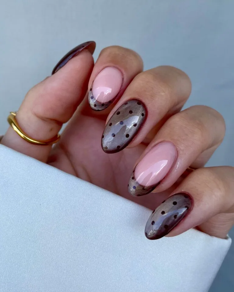
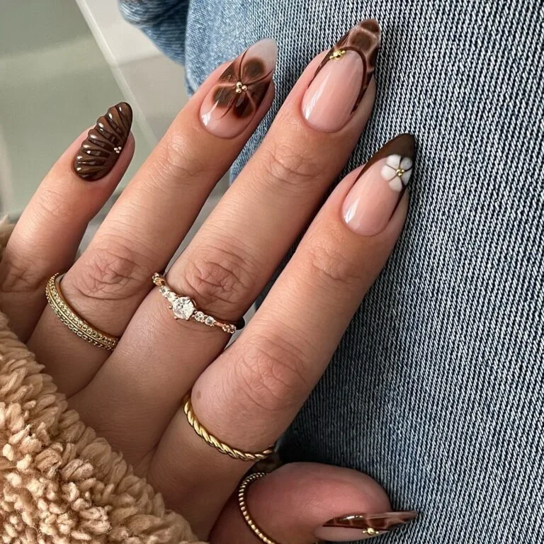
Espresso Brown
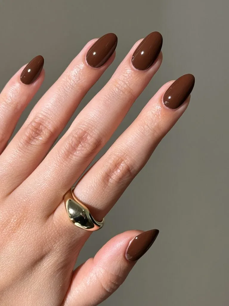
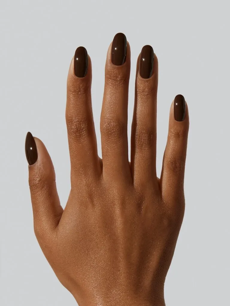
Espresso brown feels expensive because it stops short of obvious chocolate. It reads almost black first, then the brown comes through in the light.
That is what keeps it polished instead of cozy. I like it glossy and simple, especially on a clean almond or short oval shape.
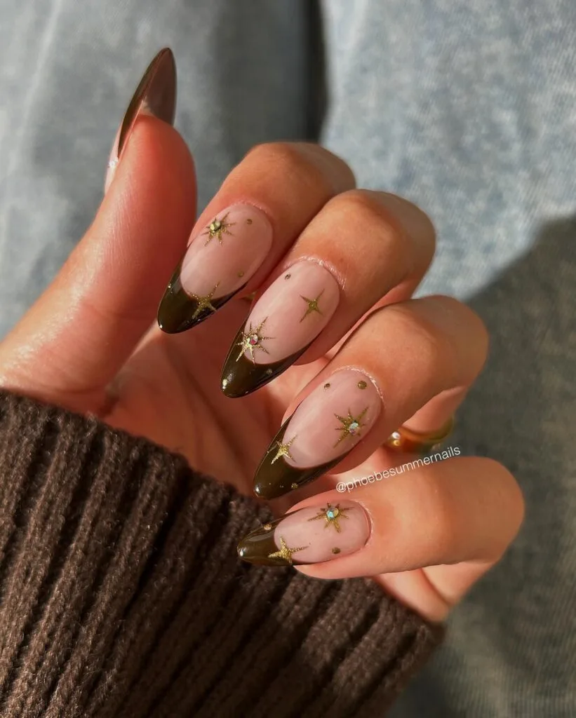
The Soft Version: Keep espresso on the French tip over sheer pink. Same depth, much less commitment.
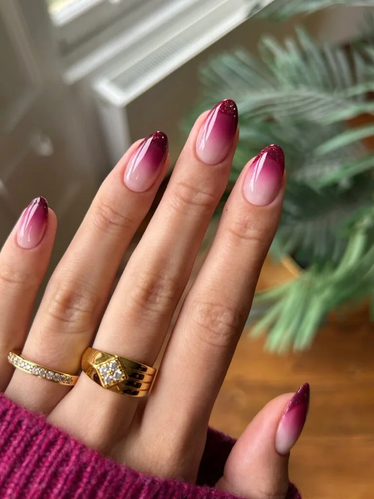
Midnight Blue
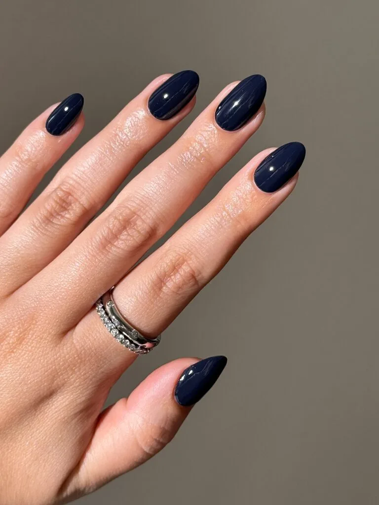
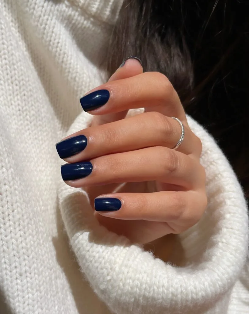
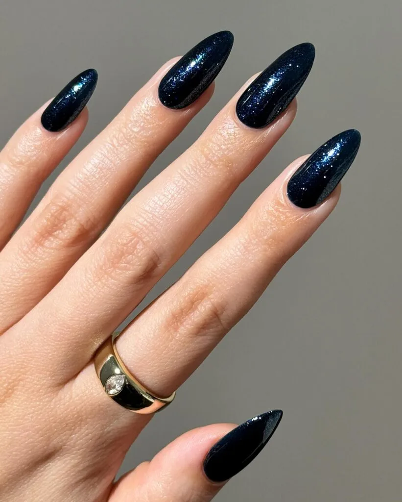
When black feels a touch too severe, this is where I’d go instead. Midnight blue has the same depth, but that inky navy underneath makes it softer and more interesting.
The glossy version is the cleanest. I like that tiny shimmer too; it reads more like dark velvet than sparkle, and the short square set proves almond isn’t required.
Forest Green
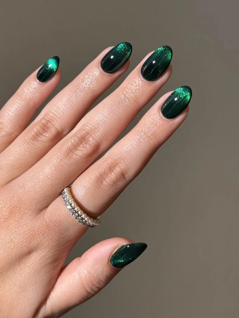
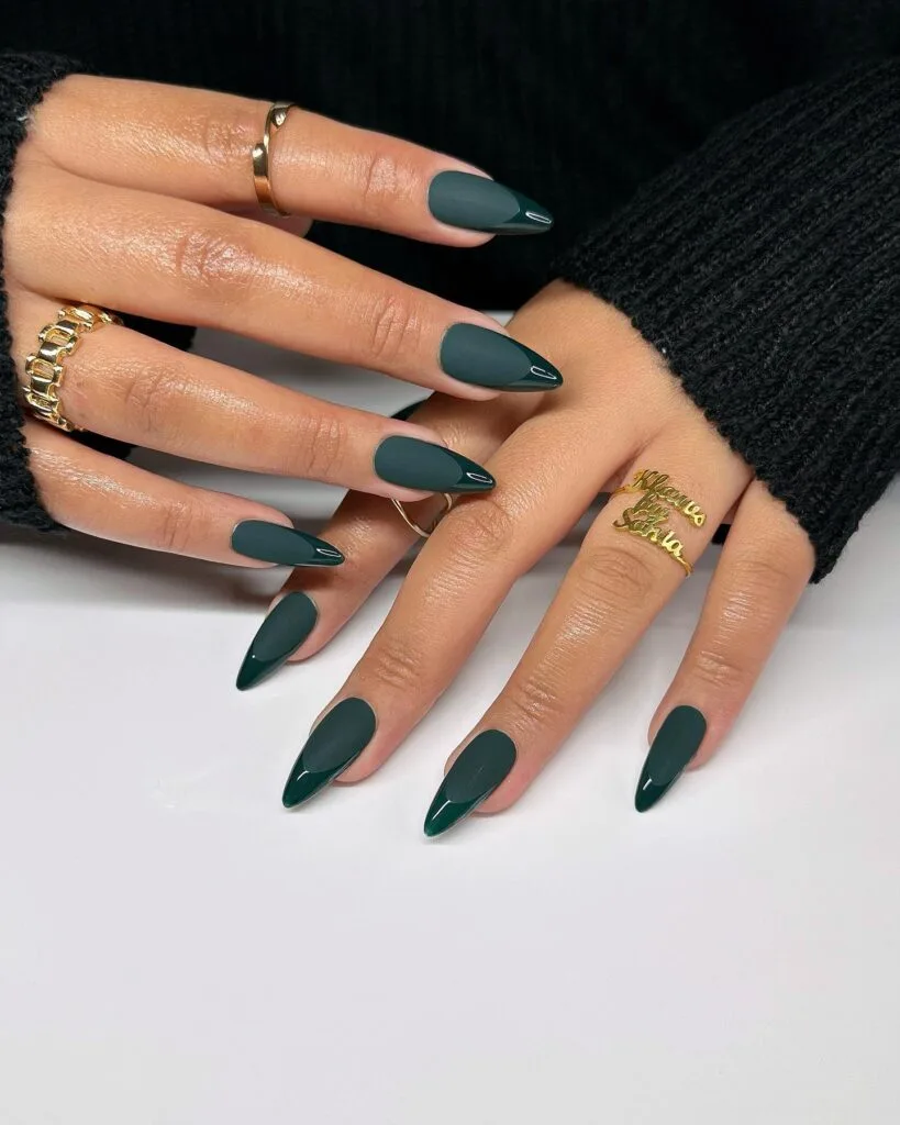
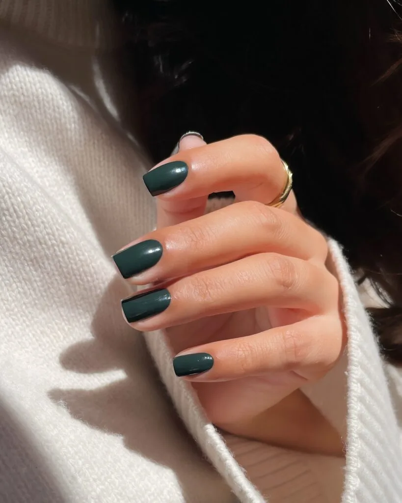
I did not give dark green enough credit until I saw how many ways this one could go.
Forest green is almost a neutral next to knits, denim, and gold jewelry, but it still has enough depth to feel deliberate.
This is the green I’d wear straight through November.
The Finish Switch: Gloss keeps it clean; magnetic shimmer pulls out the jewel tone; matte with glossy tips makes it graphic.
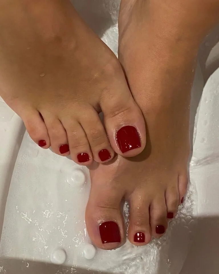
Black Cherry
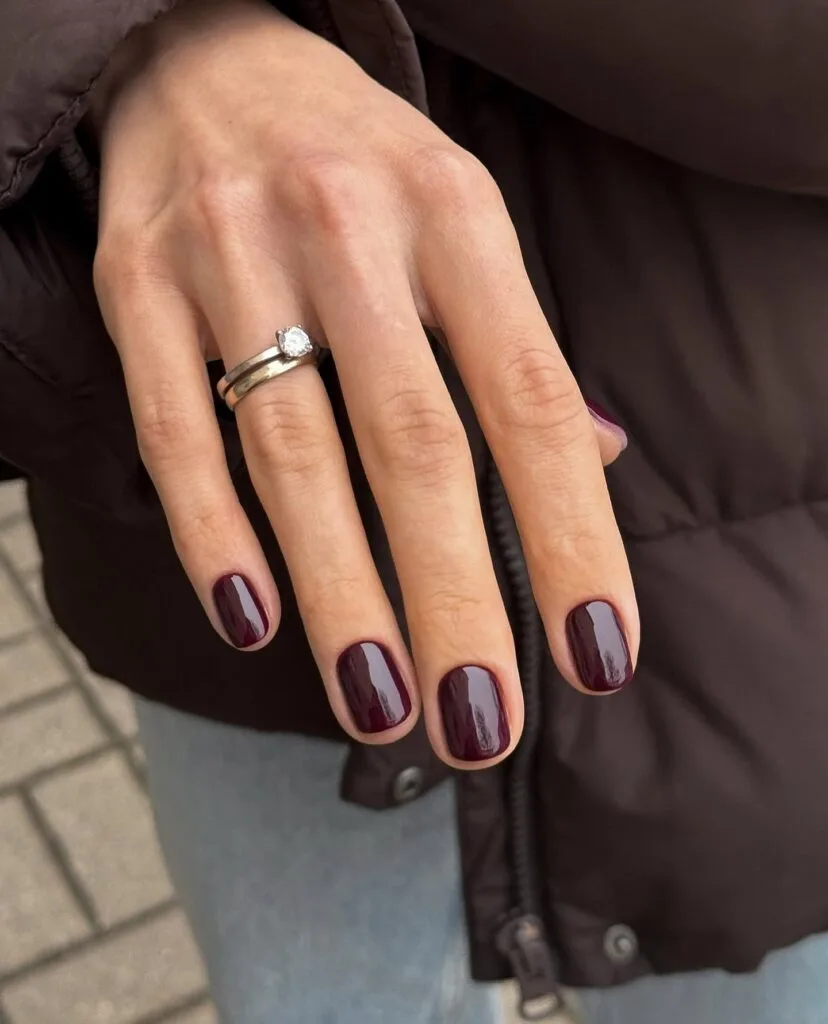
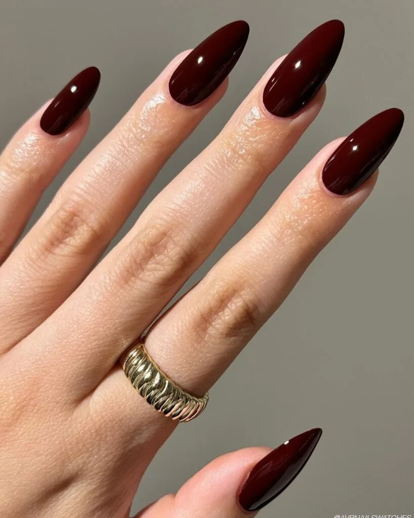
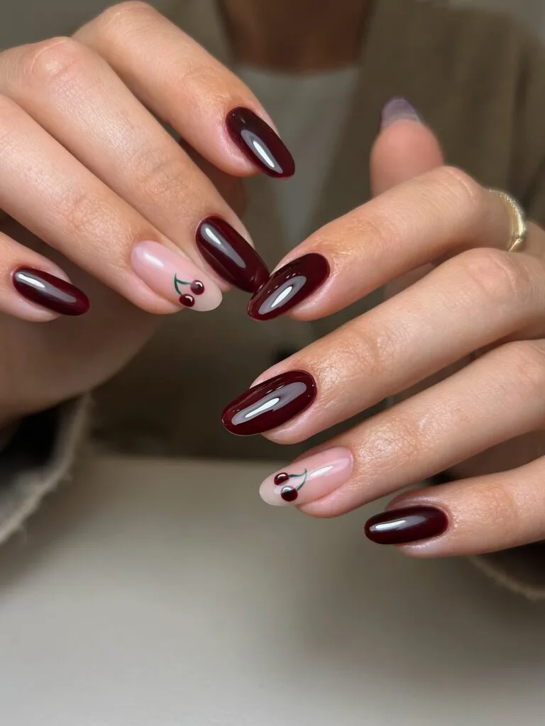
Burgundy has been my default autumn red forever, but this version is making me reconsider it. The brown underneath takes black cherry darker and richer than a bright wine red.
That is why it works on everything from a clean short manicure to a glossy almond set. And if you want cute, the tiny cherry accents are right there waiting.
Smoky Amethyst
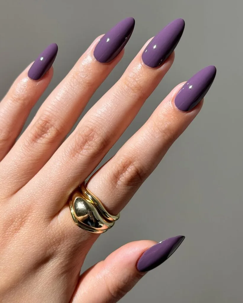
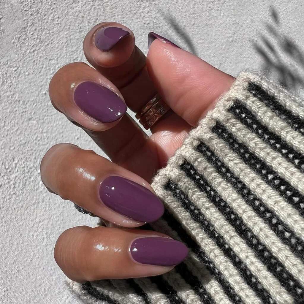
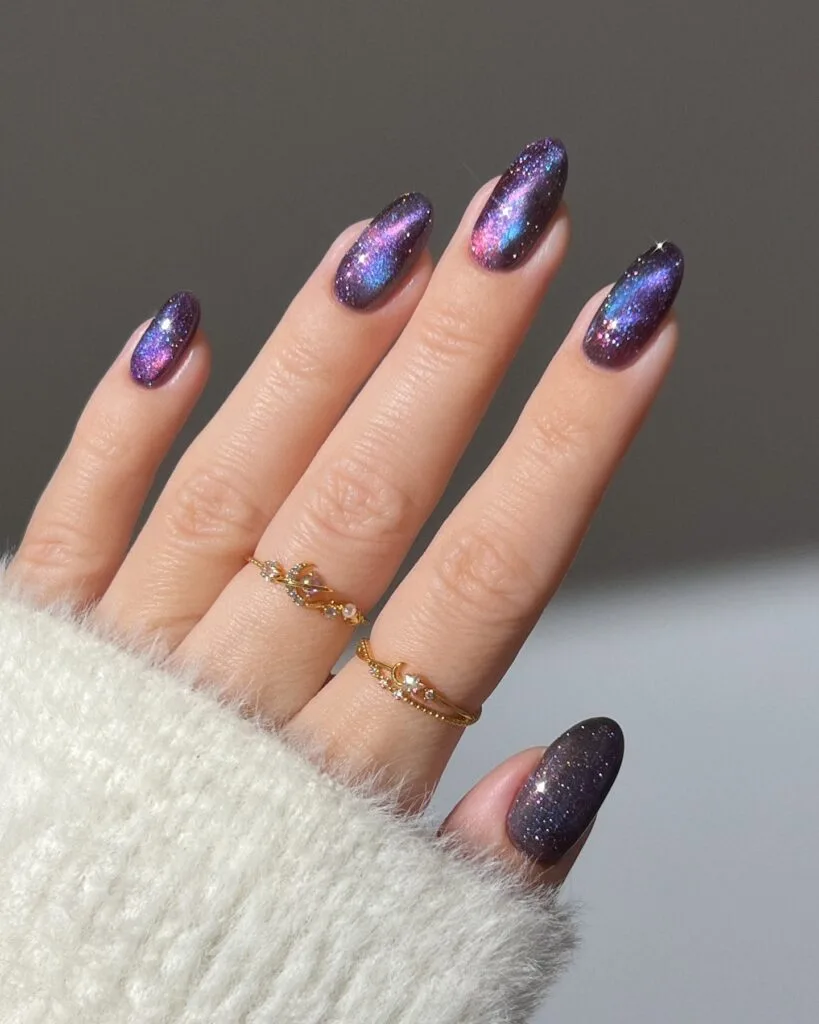
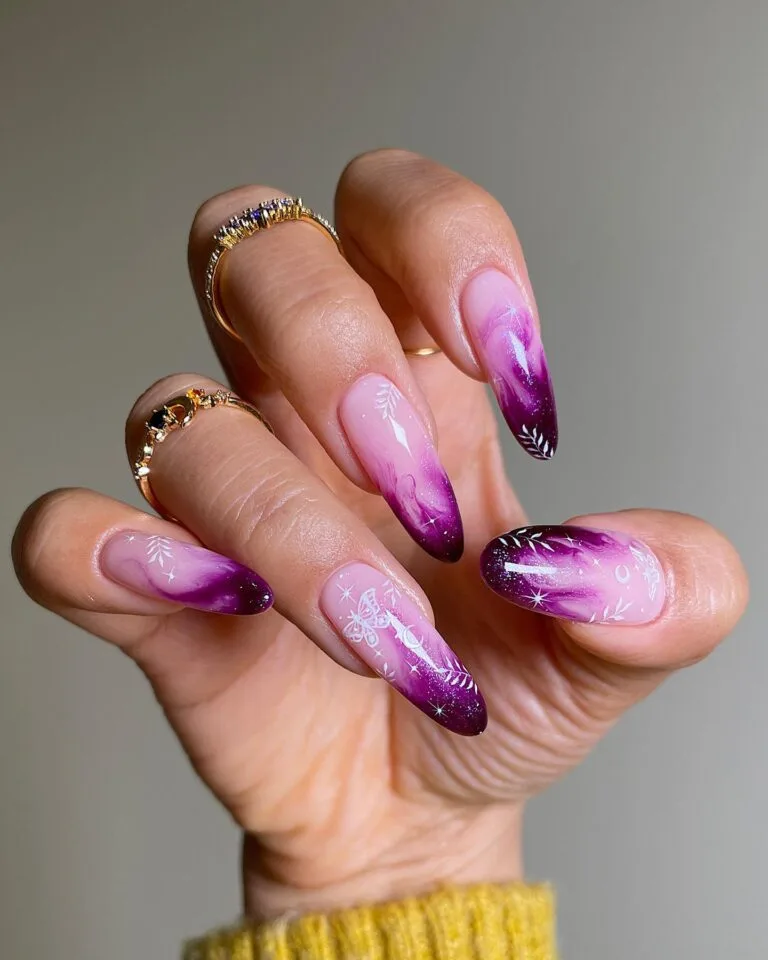
Purple usually gets prettier as it gets brighter. Smoky amethyst does the opposite, and I like it so much more for fall.
The gray underneath takes away the sweetness. Keep it glossy for that dusty, muted effect, or add a dark shifting shimmer when you want the color to come alive in the light.
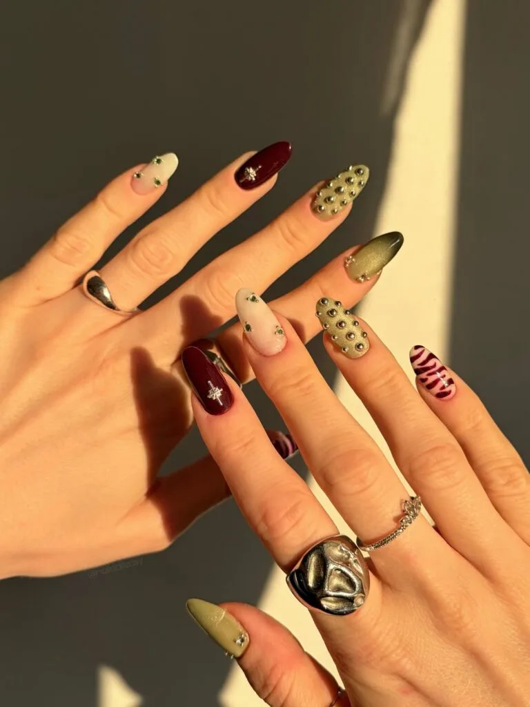
Burnt Olive
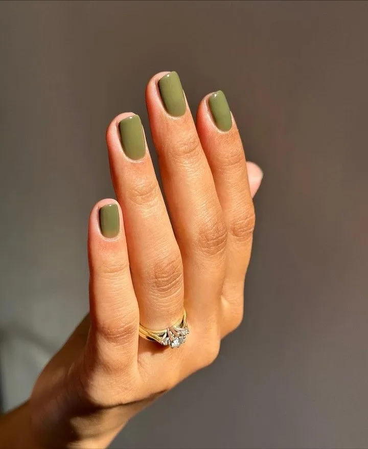
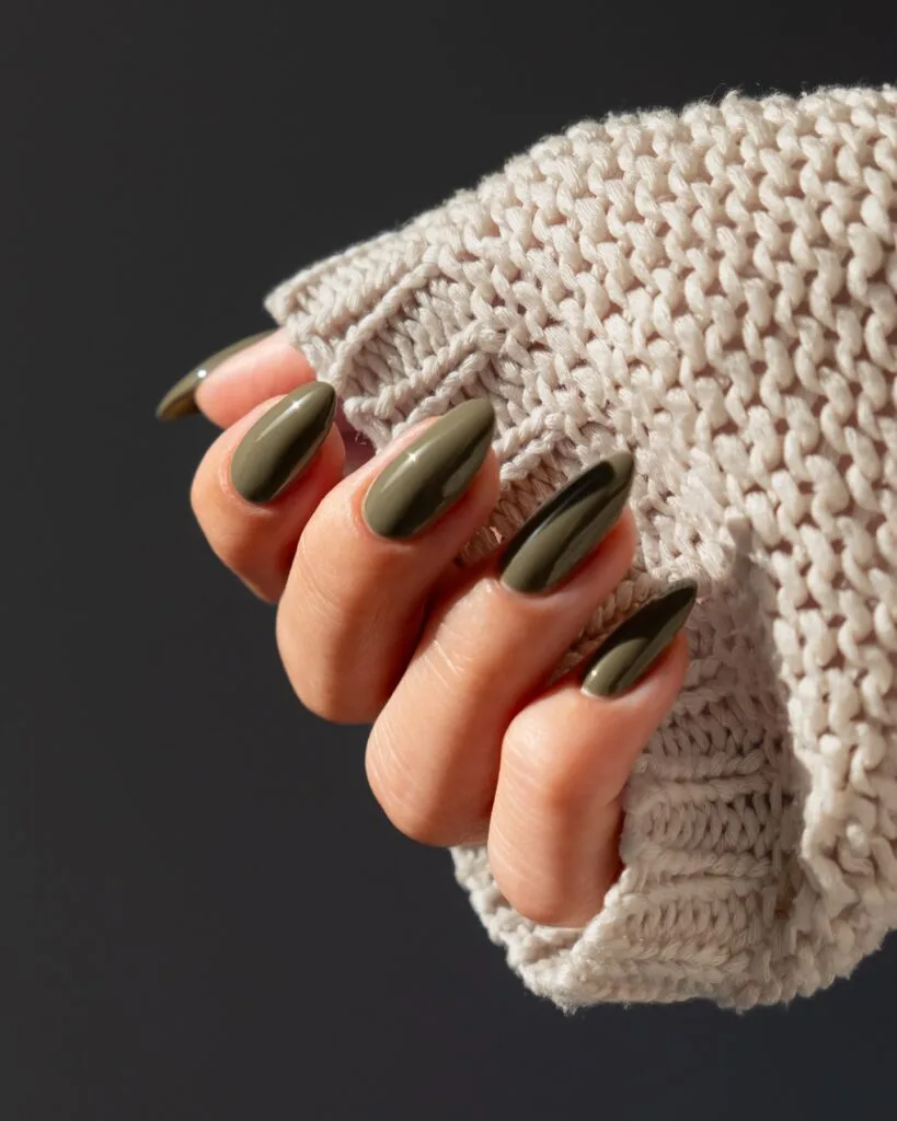
This is the color I’d expect people to skip in the bottle and love once it’s on. Burnt olive needs that muddy brown cast; without it, the shade gets too fresh and springy.
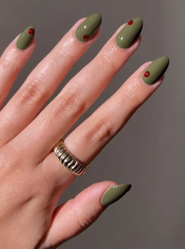
Gloss makes the depth show up best. And I weirdly love the tiny red dot version because it makes the green feel intentional instead of earthy-for-the-sake-of-it.
Oyster Gray
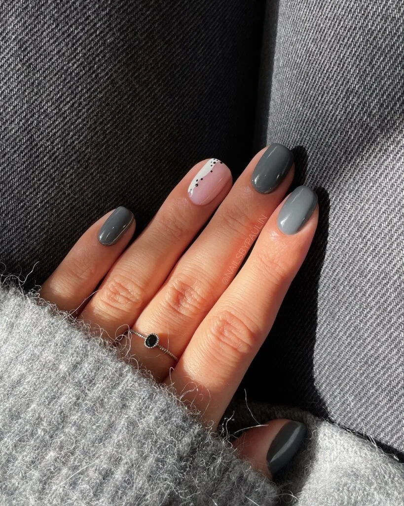
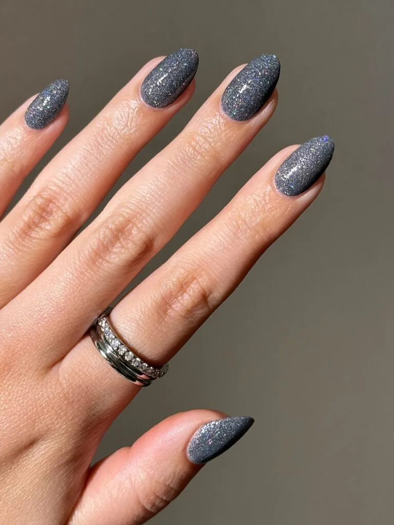
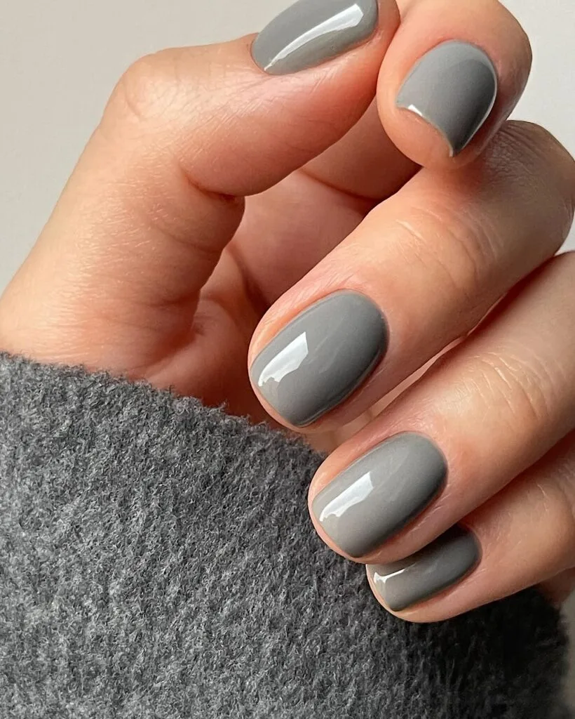
Gray can go flat on nails fast. Oyster gray fixes that by keeping a little softness in it, almost creamy rather than cement-like.
The finish does the rest. Gloss keeps the pale version clean; fine graphite shimmer makes the darker end look almost metallic. I’d take either over a chalky gray.
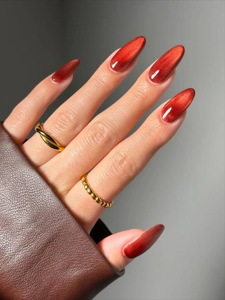
Mirrored Copper
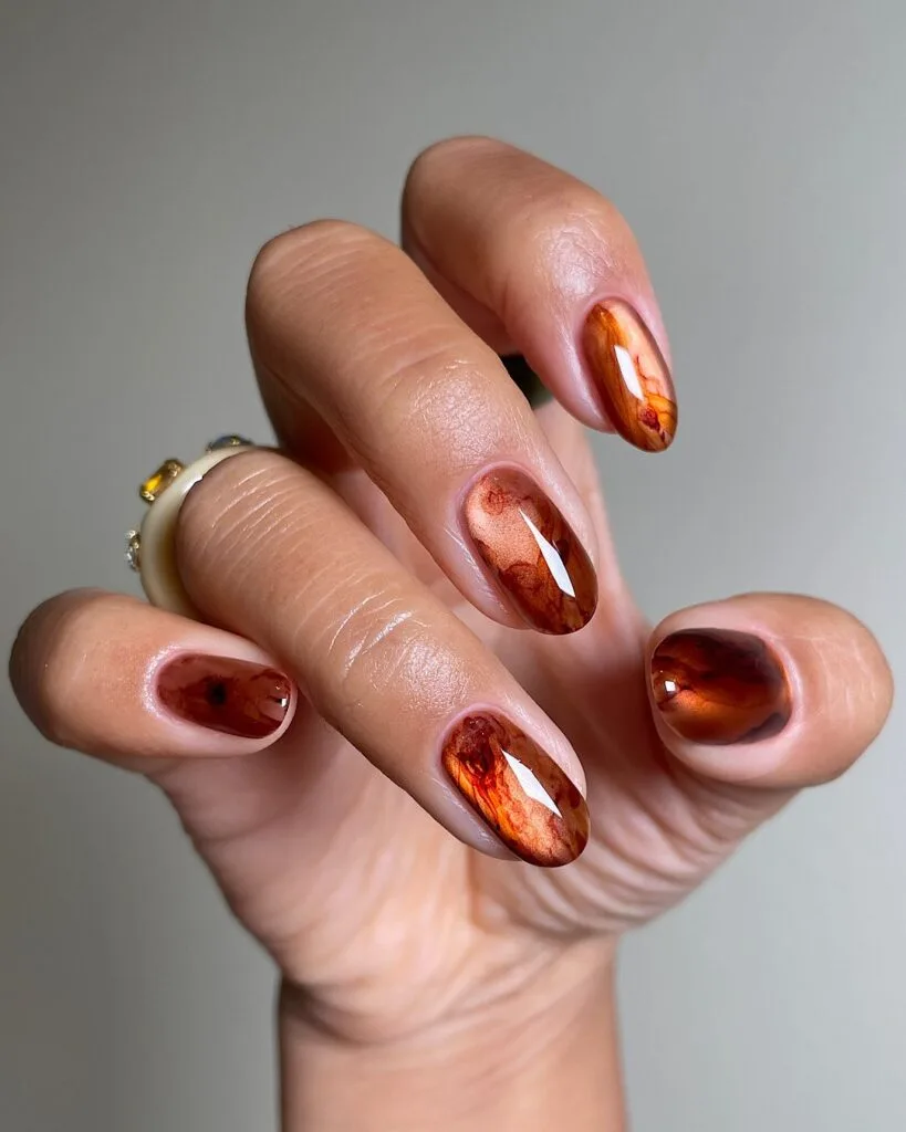
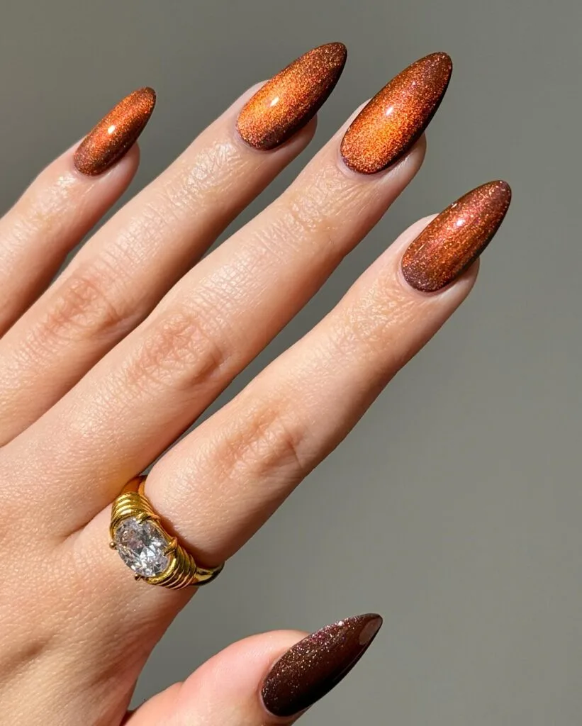
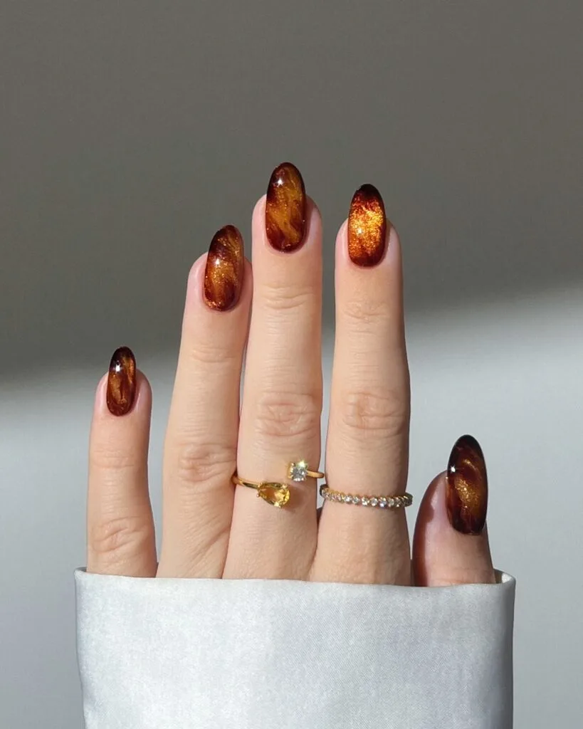
Metallic nails can get very holiday very quickly. For fall, I like copper darker and smoother, with the shine coming from reflection instead of chunky glitter.
That mirror-smooth surface is the point. The second set is my favorite; it almost looks poured under glass. The finer shimmer versions give you the same warmth with less drama.
Patent Black
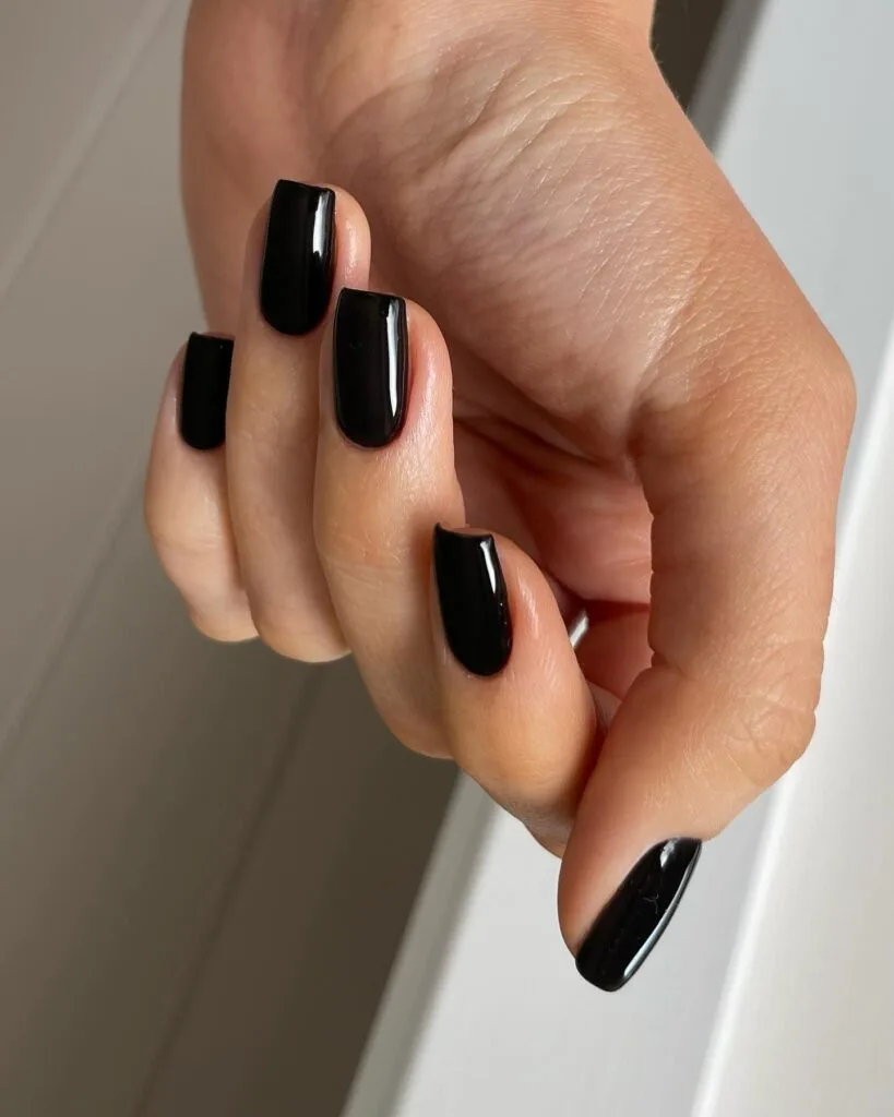
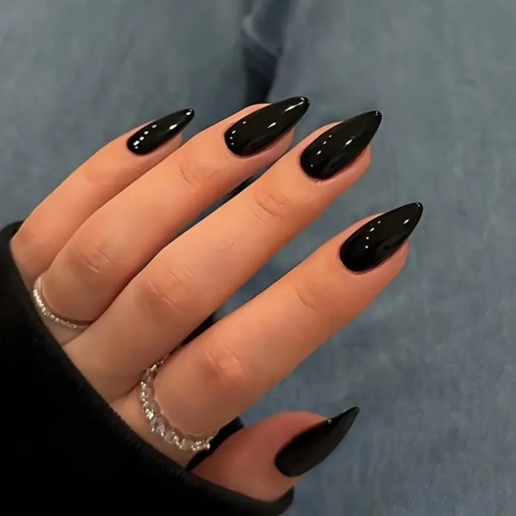

Patent black has one job: shine like crazy. Without that glassy finish, it is just black polish. With it, suddenly the simplest manicure in the post looks incredibly deliberate.
I’d keep this one completely clean. No shimmer, no art, no clever little accent nail. The gloss is the detail.
The Shape Effect: Short square makes it sleek and minimal; long almond turns the exact same black much sharper and more dramatic.
Shade It Your Way
If you want it warmer → Nudge the shade toward brown. Think brickier red, toastier olive, or copper with more bronze in it.
If you want it cooler → Ask for more gray or blue underneath. Purple gets smokier, navy gets inkier, and gray gets sharper.
If you want it deeper → Keep the undertone and take the color darker. Do not just swap it for black or you lose the part that made the shade interesting.
If you want more shine → Go glassy or mirror-smooth. Patent gloss and fine metallic finishes keep the color clean; chunky glitter changes the whole mood.